Project Update – April 8th, 2018
The last month or so have been spent on building the user interface and making it actually usable. Equipping weapons isn’t exactly a thrilling part of the Shining experience, but it’s an important one.
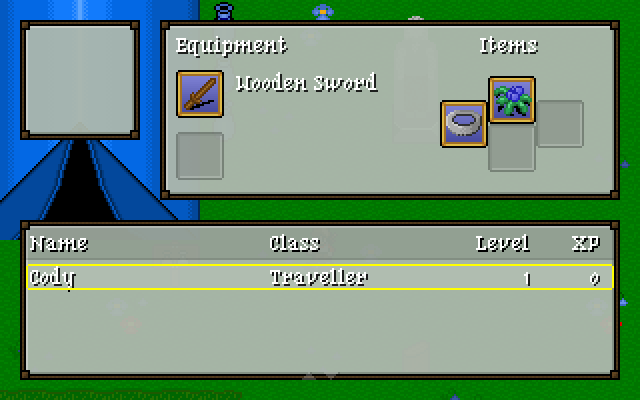
Right now Shining Online’s item screen looks something like this:
Exciting, right?
Even though it’s a simple screen there’s quite a lot going on.
The equipment and inventory items are entirely data driven (finally). That means the text, icons, backgrounds and slots aren’t hard-coded anywhere. The Silver Ring icon is ugly as sin, but I’m pretty happy with the others.
In the screenshot Cody is on his lonesome, but there are other characters in town that will join up and end up in that window. Character stats are available by moving right on the table, just like in other Shining Force games. Naturally it’s also data driven.
Even the window layout is defined in a file rather than in code. Coupled with some dev tools this makes it possible to tweak appearances and see updates in real-time.
The table at the bottom was extremely time-consuming and has given me a new appreciation for how browsers display HTML tables. The current table implementation supports headers, variable column widths, column alignments and smooth scrolling.
So far I’ve added the ability to equip and un-equip weapons and accessories. Dropping items shouldn’t take too long to add, but I’m expecting giving items to team mates to be a bigger job.